What is metabase?
Metabase is a business intelligence platform. You can use metabase in IA to explore your data and develop your own visualizations and graphics in order to make your data analysis.
There are 3 levels of analytics that can be built in metabase:
-
Program or cohort level
-
Group level
-
Participant level
There are 2 tabs the data can be displayed in IA:
-
Statistics tab: planned for analyzing demographics;
-
Evaluation tab: planned for showing the program impact and results.
In the table below we are summarizing how relation between the levels and the possible displays in IA:
| Level | Statistics | Evaluation |
| Cohort | Program statistics cohort | Program cohort |
| Group | Group statistics cohort | Group cohort |
| Participant | N/A |
Participant cohort |
How to access metabase?
Initially, each client will have their own metabase instance and credentials that will be shared by IA. The final goal is to access metabase through IA.
.png)
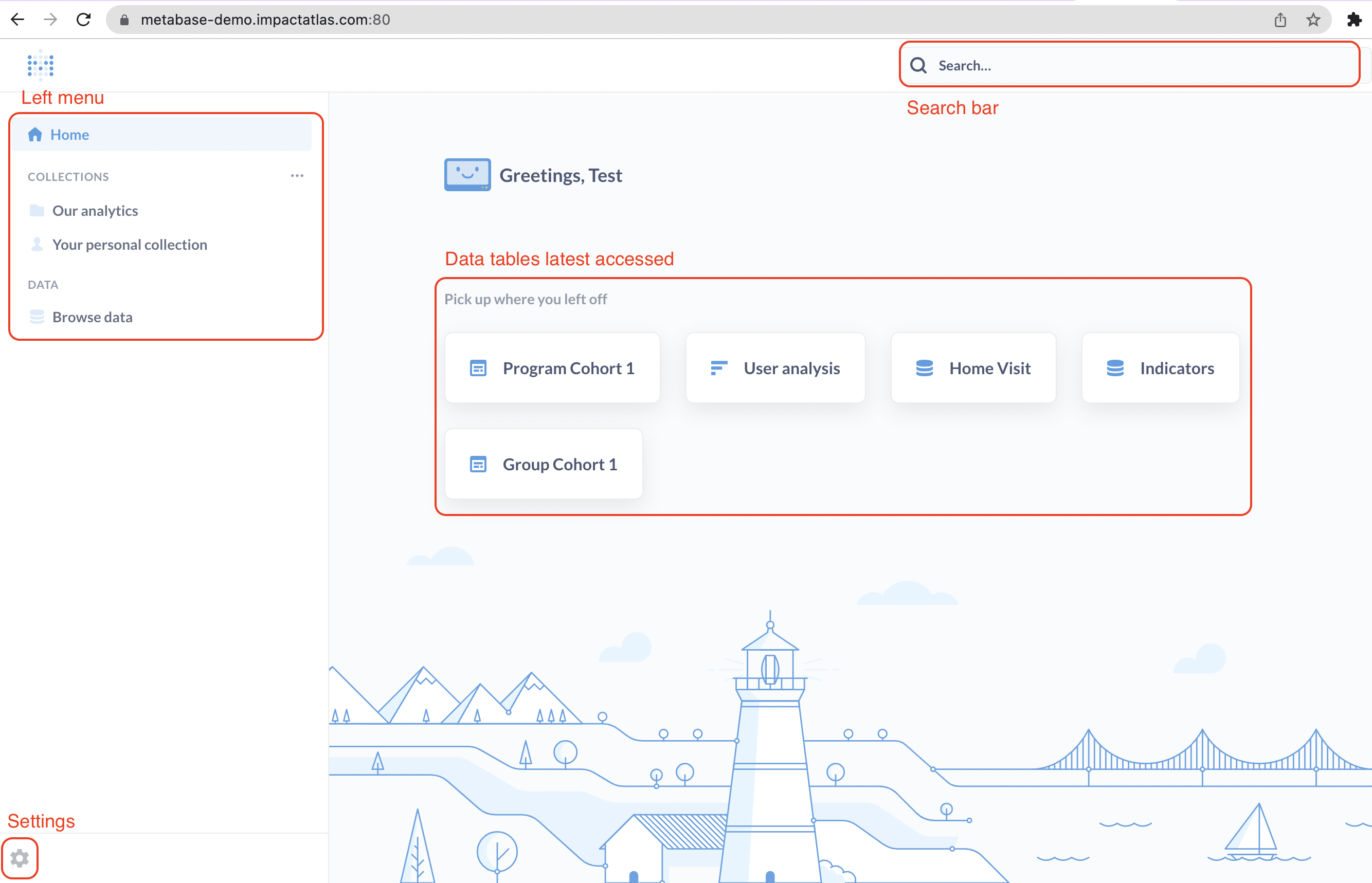
Once you log in, there are few aspects in the initial page:
Once you log in, there are few aspects in the initial page:
-
Left menu considering the key elements you are going to access;
-
The settings in the bottom left;
-
Recent data accessed by you in the main screen;
-
Search bar in the top right;
.png)
How to create my own graphics on metabase?
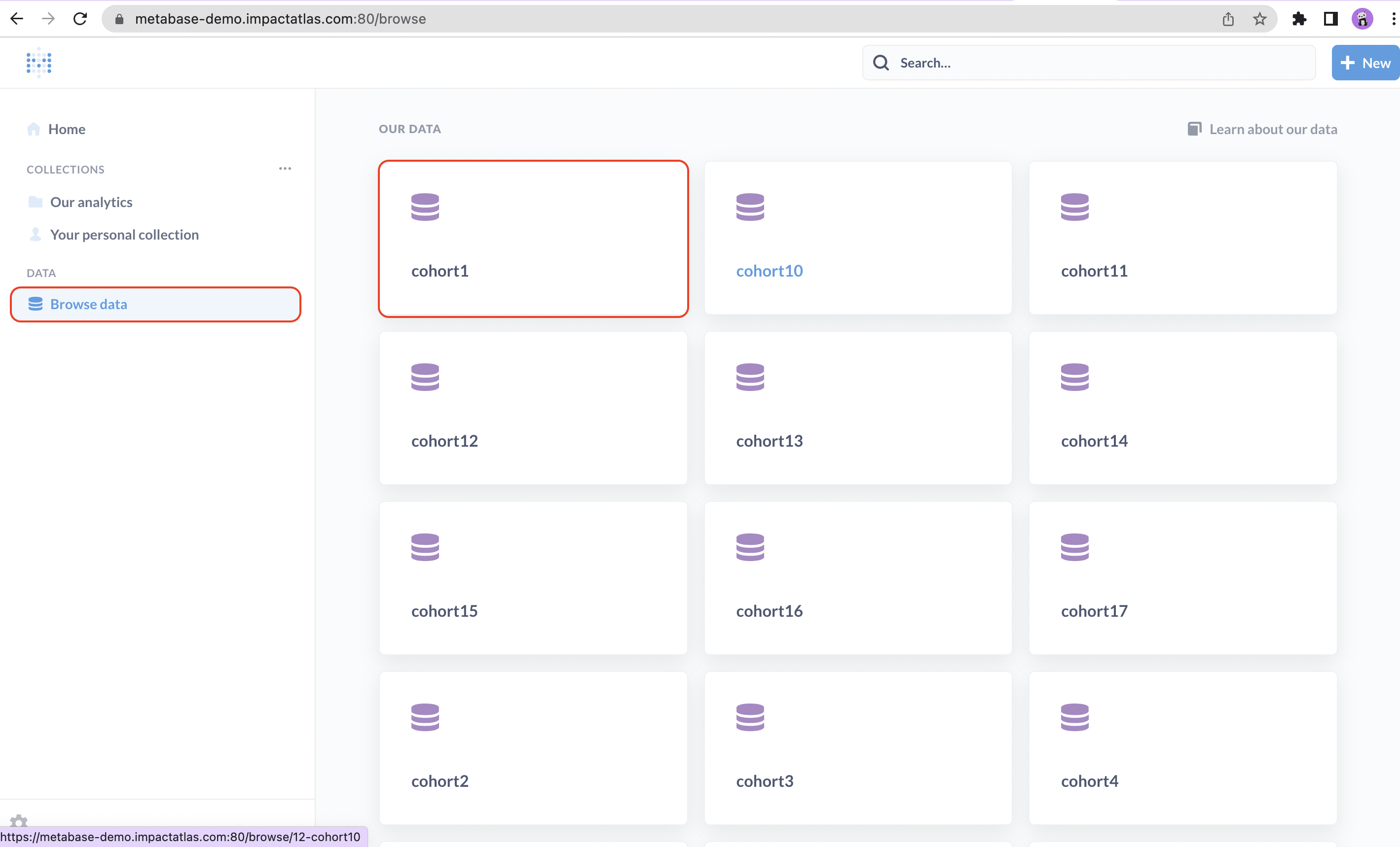
First step is the data selection. In the left menu, click on "Browse data" and then select the cohort you want to work with. If you see the cohorts numbers instead of names, don't panic, we are going to provide you a reference list. The final goal is to have the cohort names to facilitate the search.
.png)
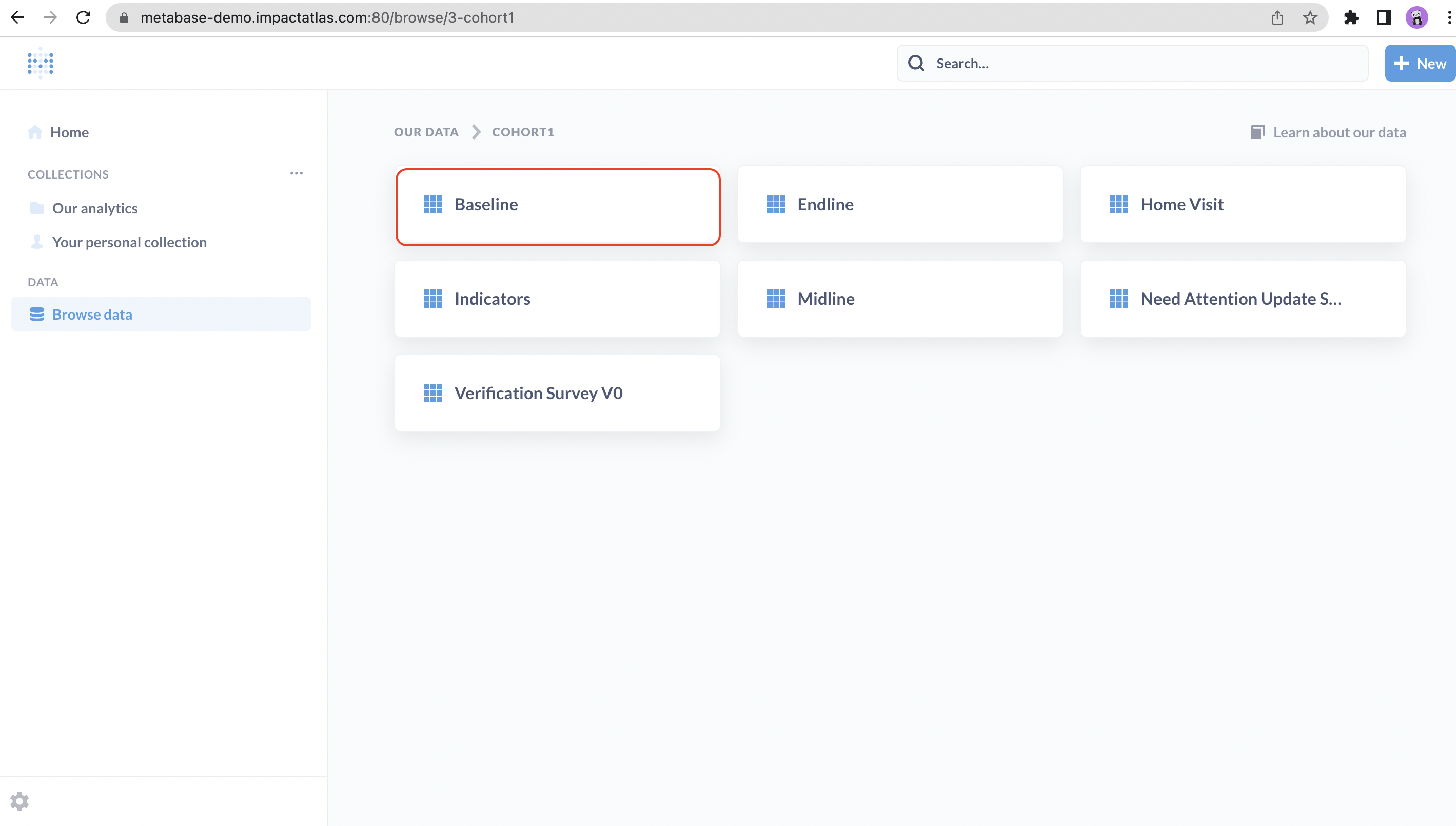
After selecting the cohort, you need to choose each data source (survey) you want to work with.
.png)
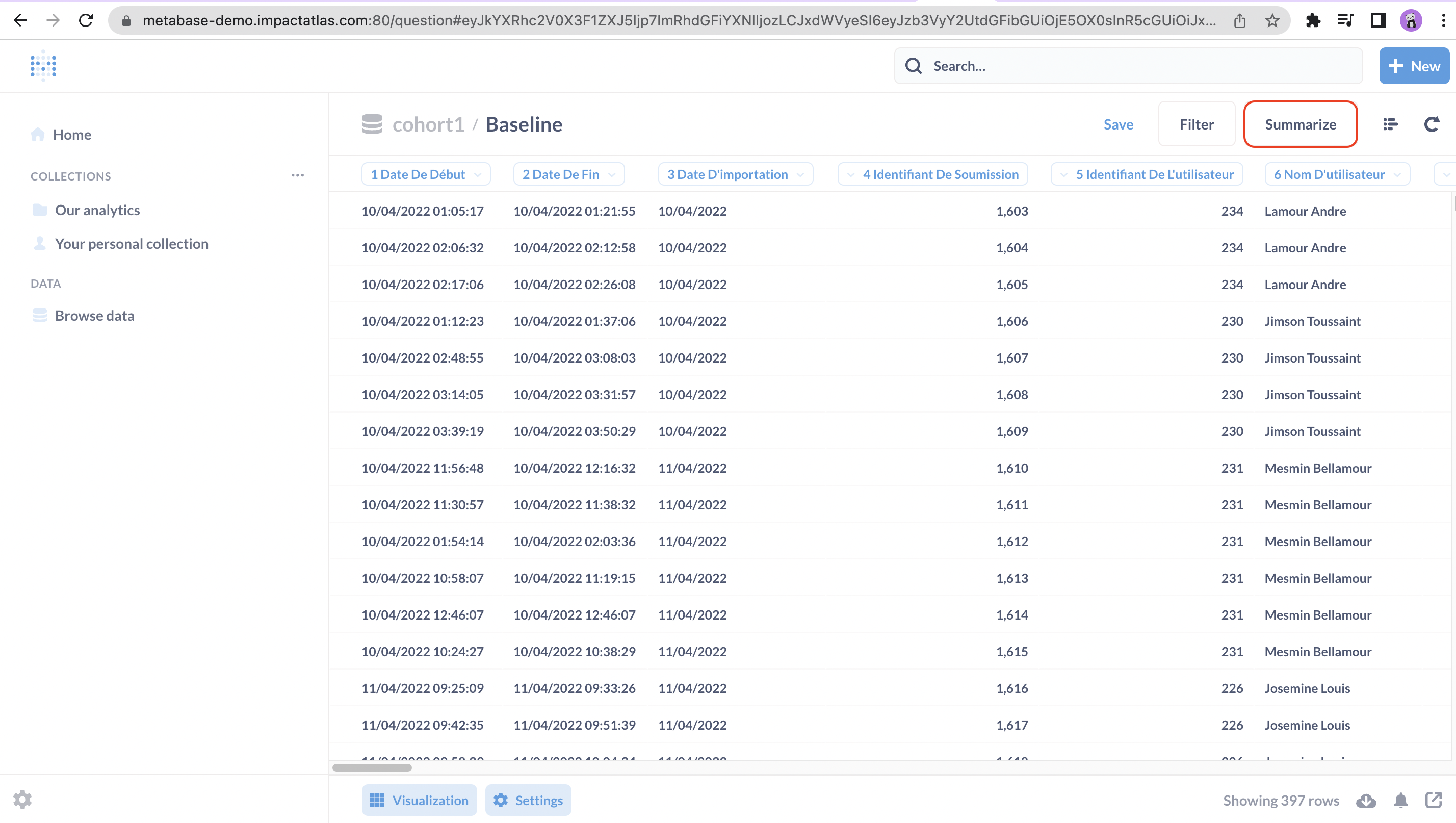
Once you select the survey, you are going to see all the data available related to that survey in a tabular form. Click on "Summarize" to start creating your own graphics.
.png)
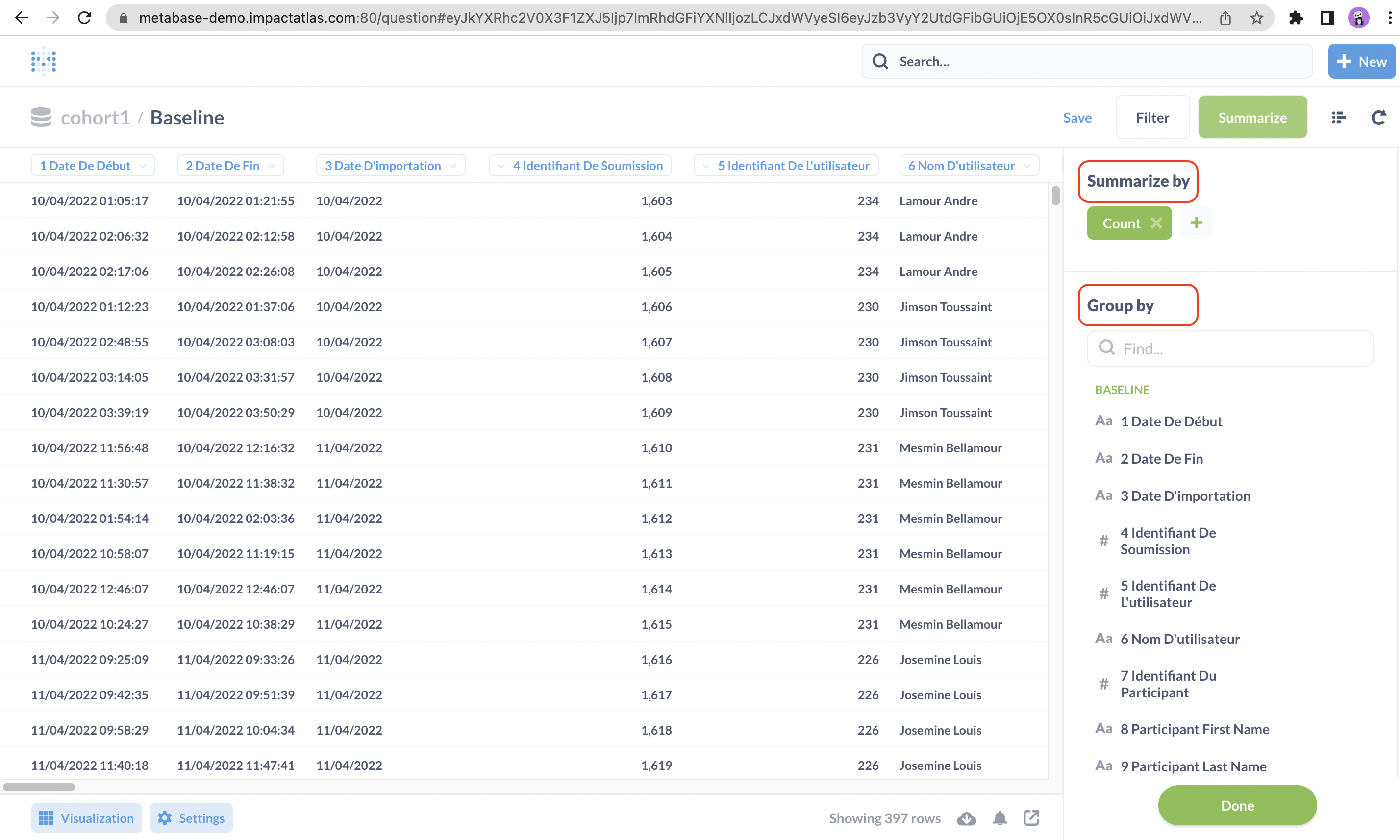
The following step is to decide which data points should be used to create your graphics and how you would like the data to be summarized, for example, by count, minimum, maximum, etc.
.png)
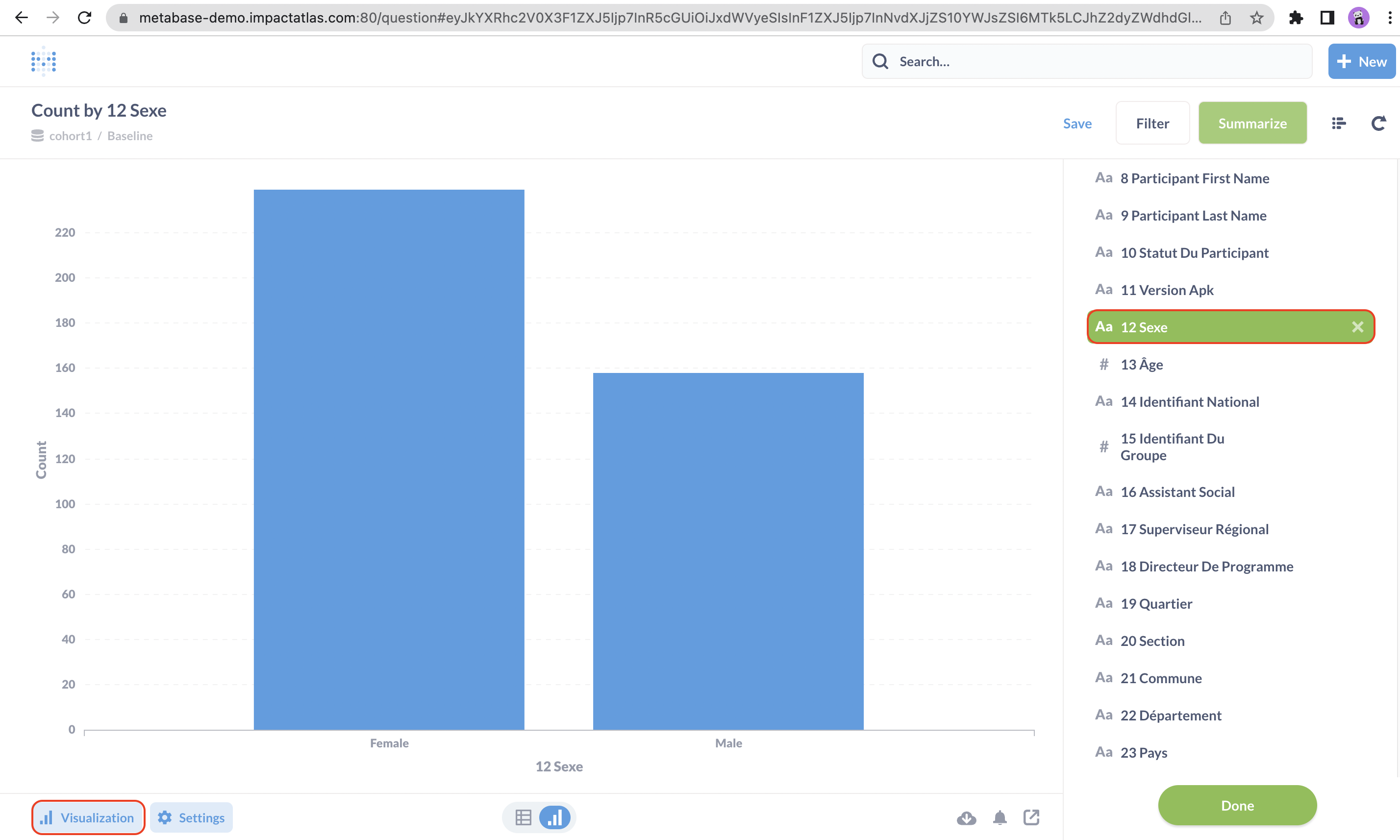
In this example, we are going to do a count by gender to understand the participants distribution between male and female. Once you select the data point, a bar chart will be shown. You can click on "Visualization" to customize your chart.
.png)
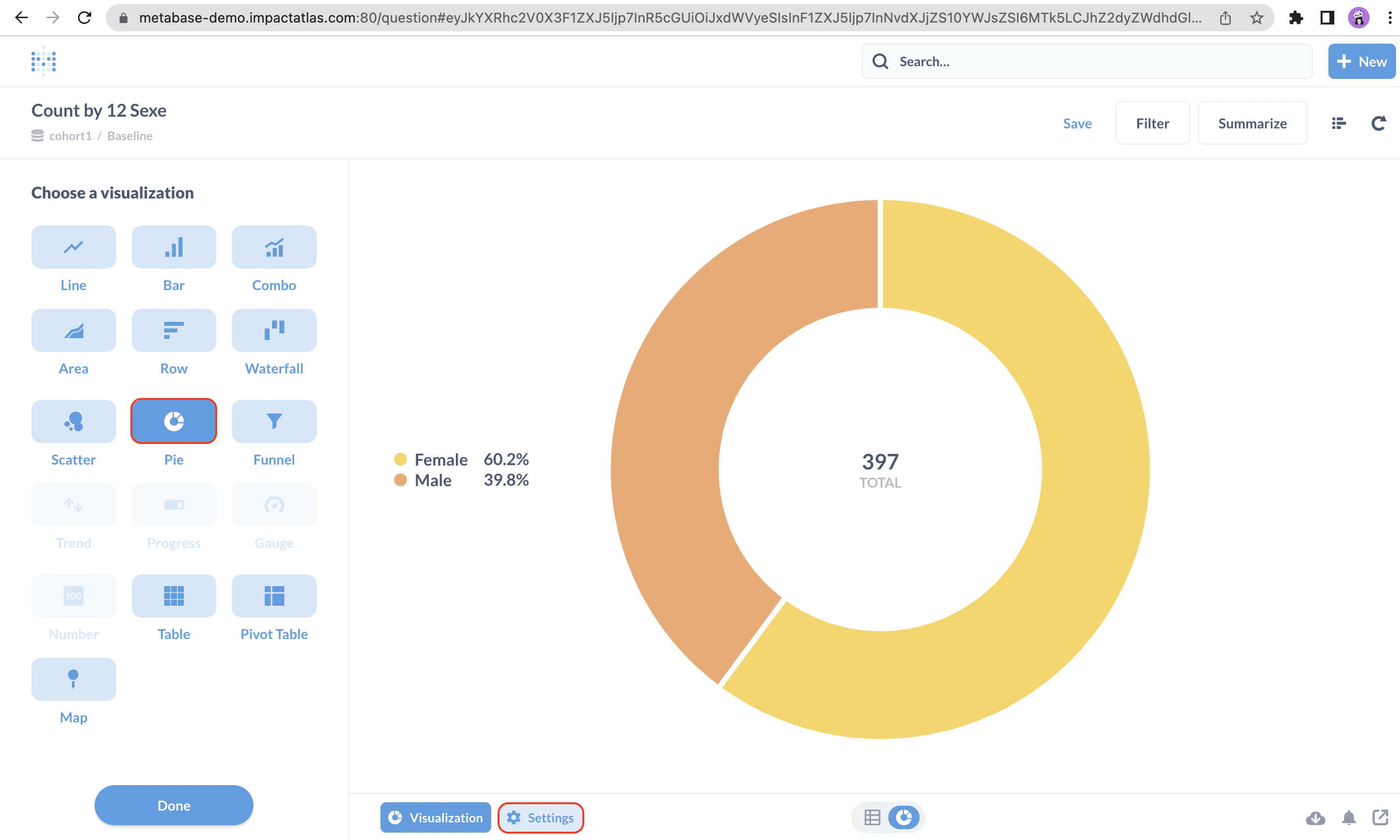
You can choose a chart type of your preference and then click on "Settings".
.png)
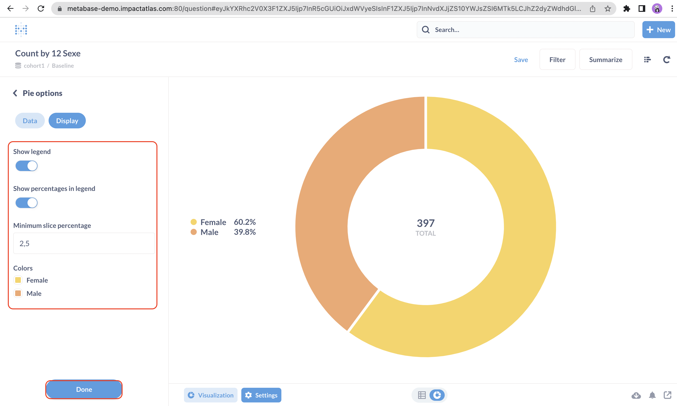
Under settings, there are few customization options such as updating the legend, the colors and so on. Once you finish the edition, hit "Done" in the bottom of the screen.
.png)
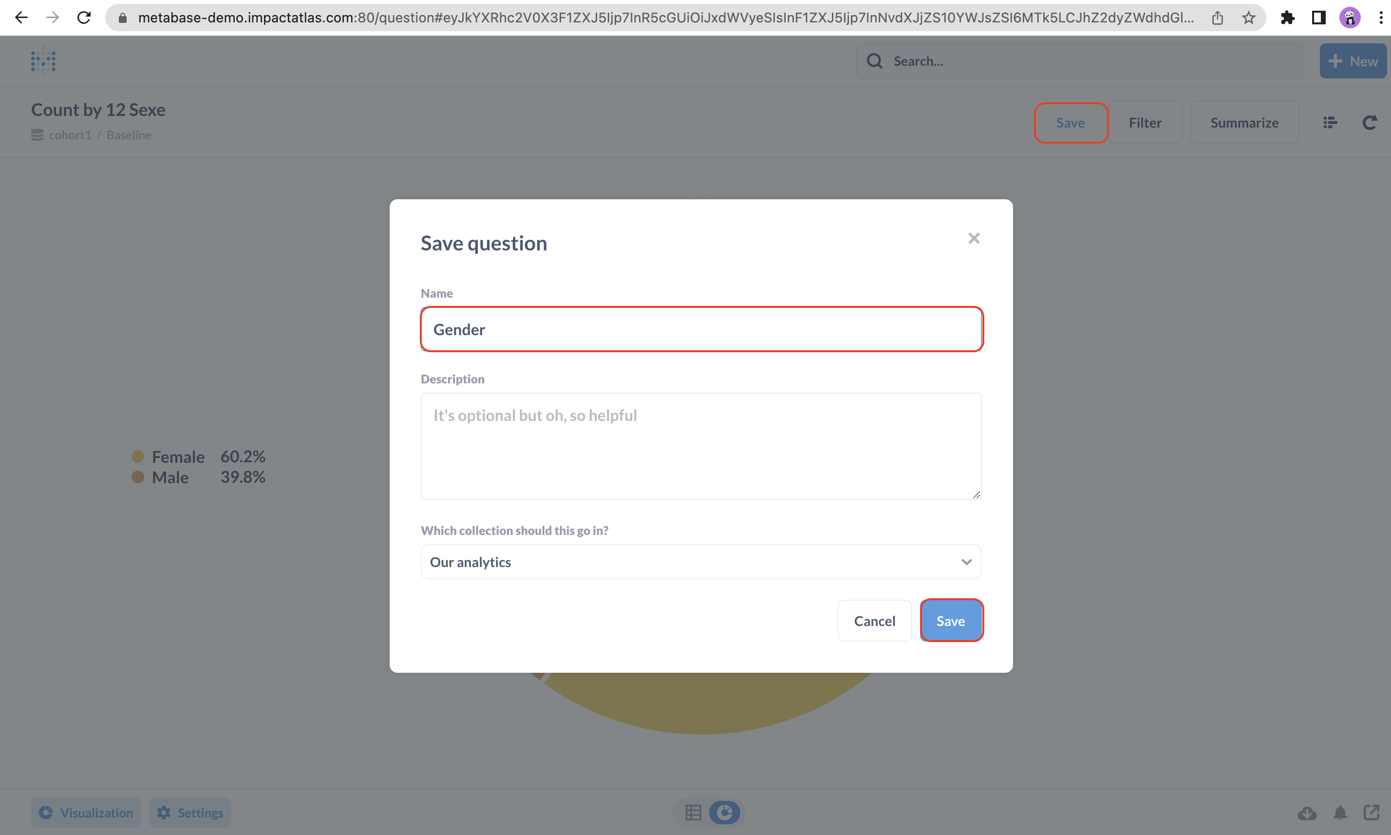
Then, click on "Save" and a new window will pop up for you to enter the name of the chart. Once you named it, hit "Save".
.png)
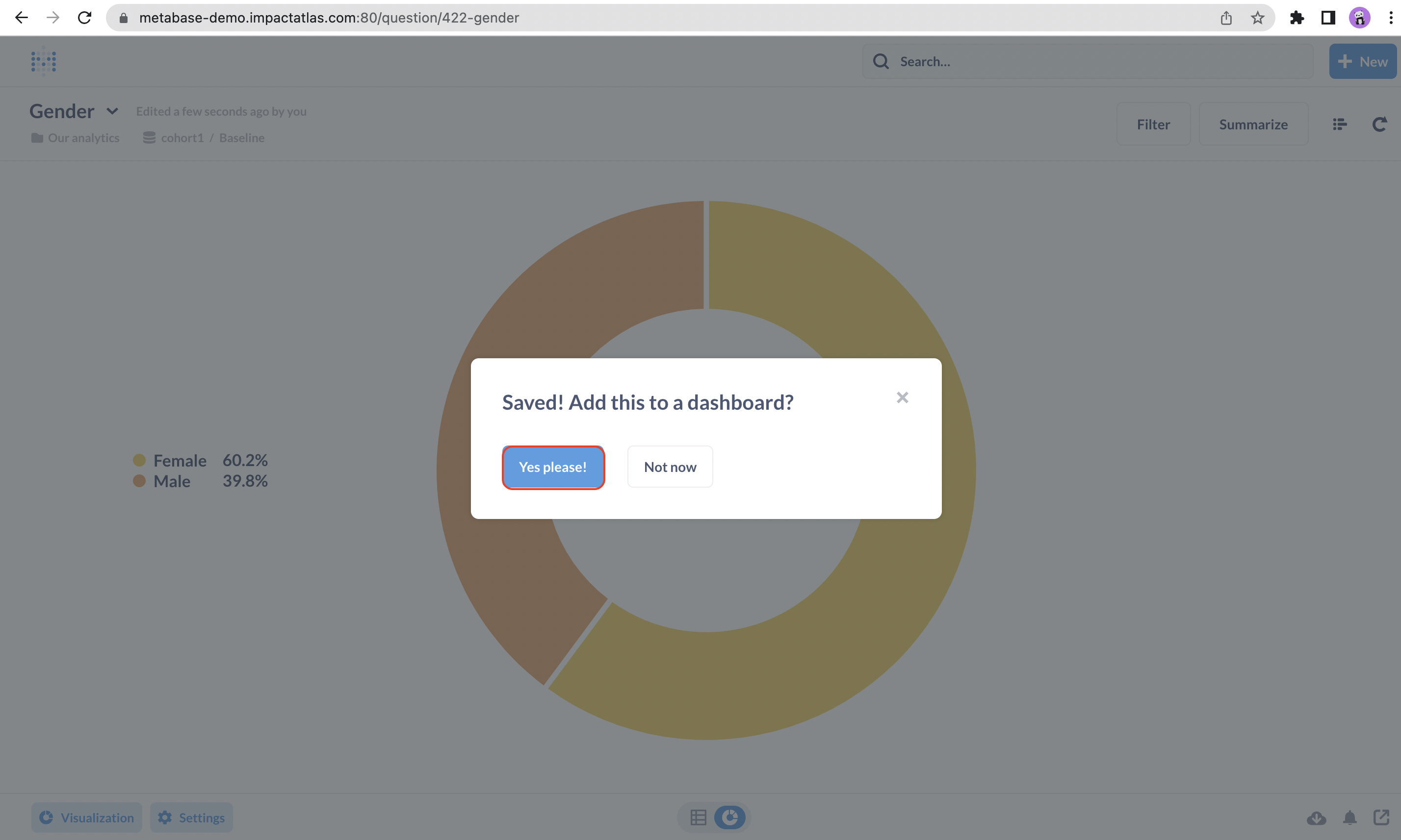
A new pop up will appear asking if you want to add this chart to a dashboard, you can click on "Yes, please!" if you want to assign to a dashboard or "Not now" in case you prefer to add it afterwards.
.png)
In case you want to add it, a new pop up will appear for you to select the dashboard. You can either look for the dashboard rolling down the list or use the search bar at the top. Once you find it, you can click on it.
Note: if you have any questions about the different types of dashboard, you can refer to this article to find more information.

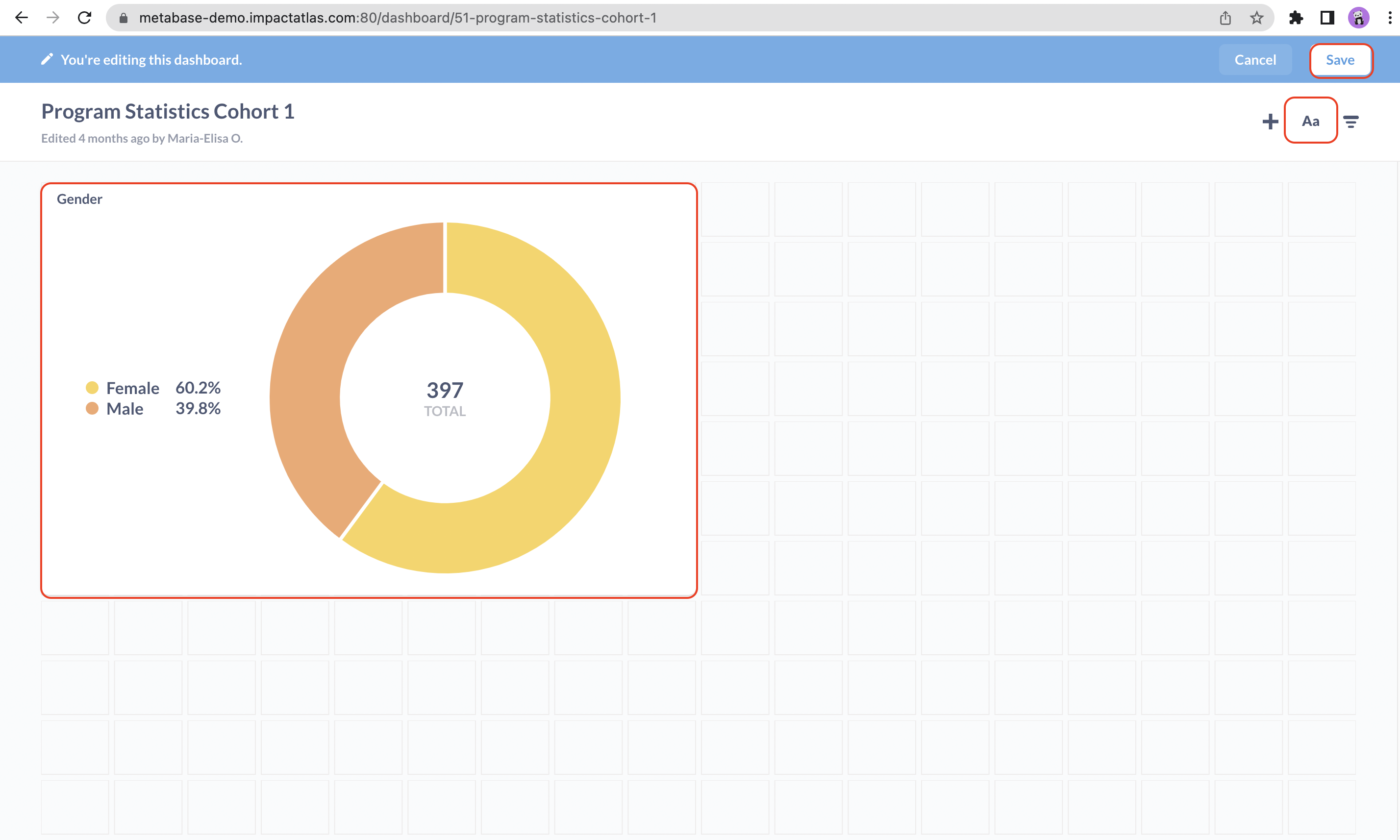
In this page, you can resize or reposition your graphics. You can add text by clicking on the "Aa "option in the top right. And, once you finish editing, you can hit "Save".
.png)
How to add filters for groupID and participantID?
By default, all the graphics you create on metabase are at program / cohort level. In order to have the data visualization at group or participant level, you need to add a filter to it.
First step, search for the dashboard you want to edit under "Our Analytics". Remember: if you want to add a group filter, you should select the corresponding group dashboard. And the same for the participant.
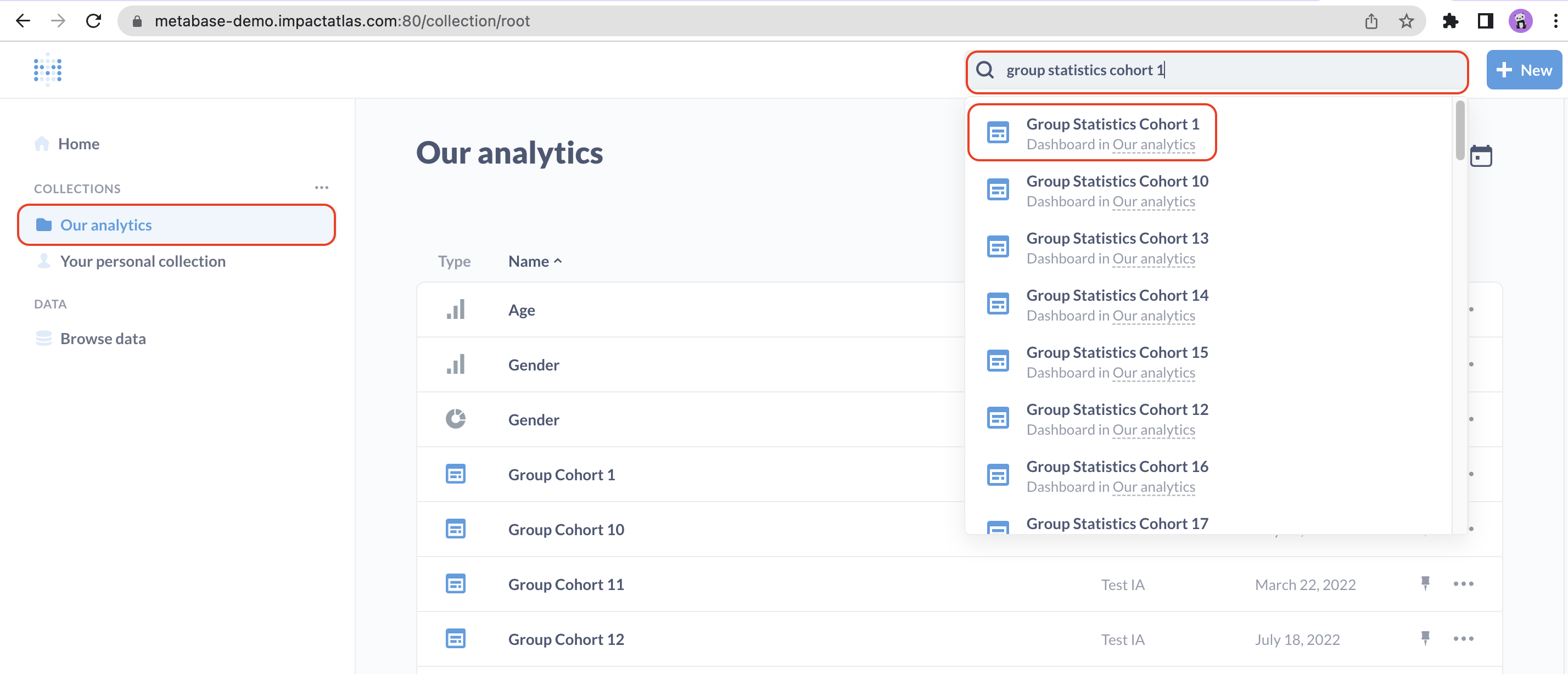.png)
Then, click on "Edit dashboard" in the top right.
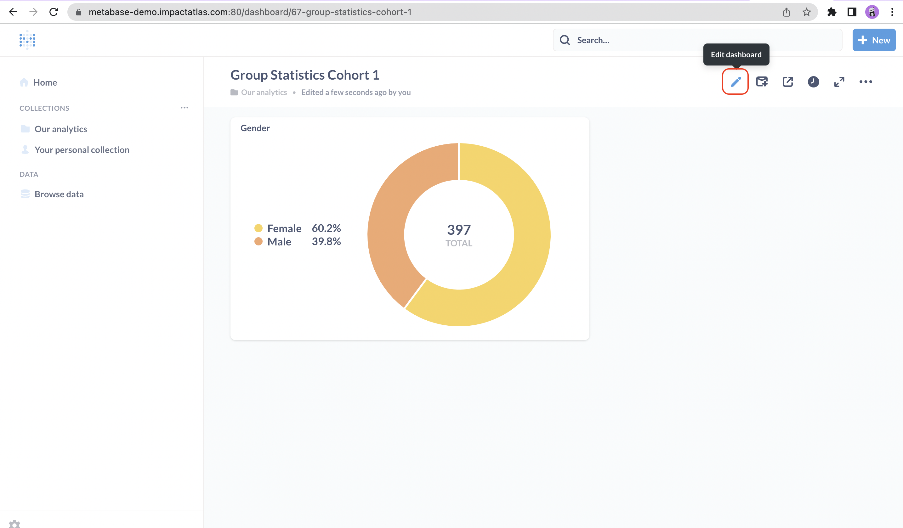.png)
Click on filter icon also in the top right of the screen and choose "number".

Select the "Equal to" option.
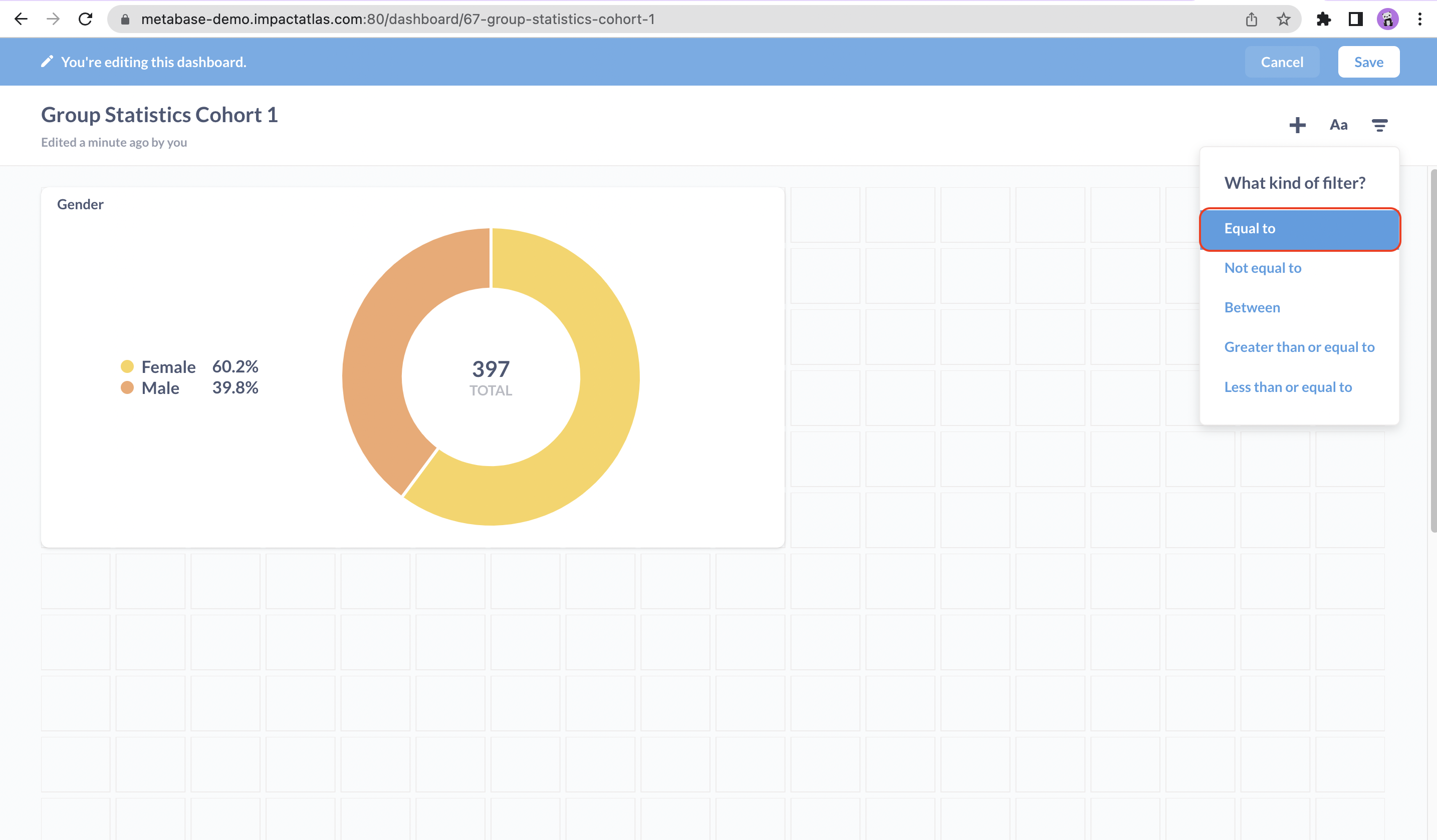.png)
For adding group filter, you can type "GroupID" in label field and select GroupID in the graphic. The process of adding the filter should be applied to each graphic.

For adding participant filter, you can type "ParticipantID" in label field and select ParticipantID in the graphic. The process of adding the filter should be applied to each graphic.
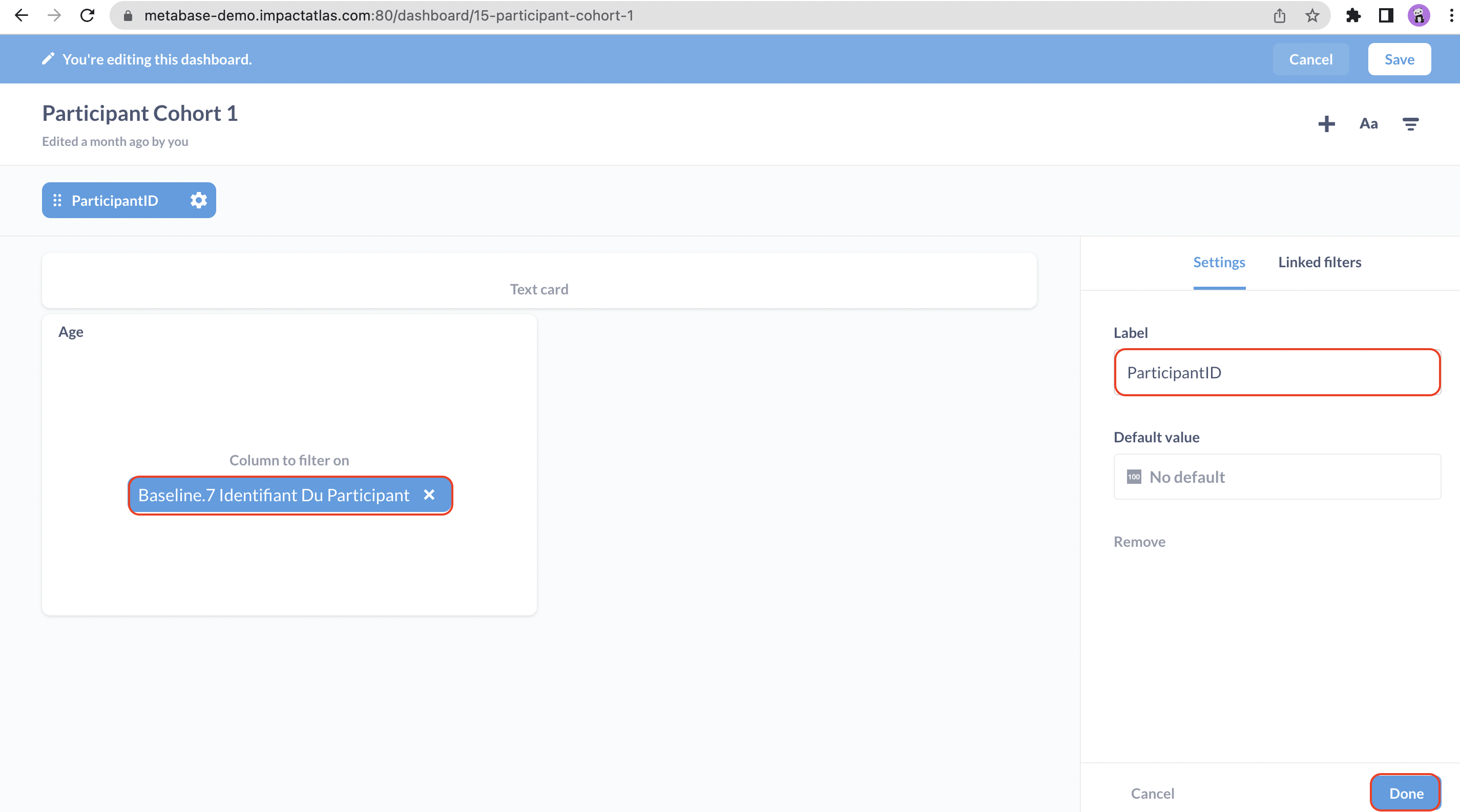.png)
Once you are done, click on "save".
.png)
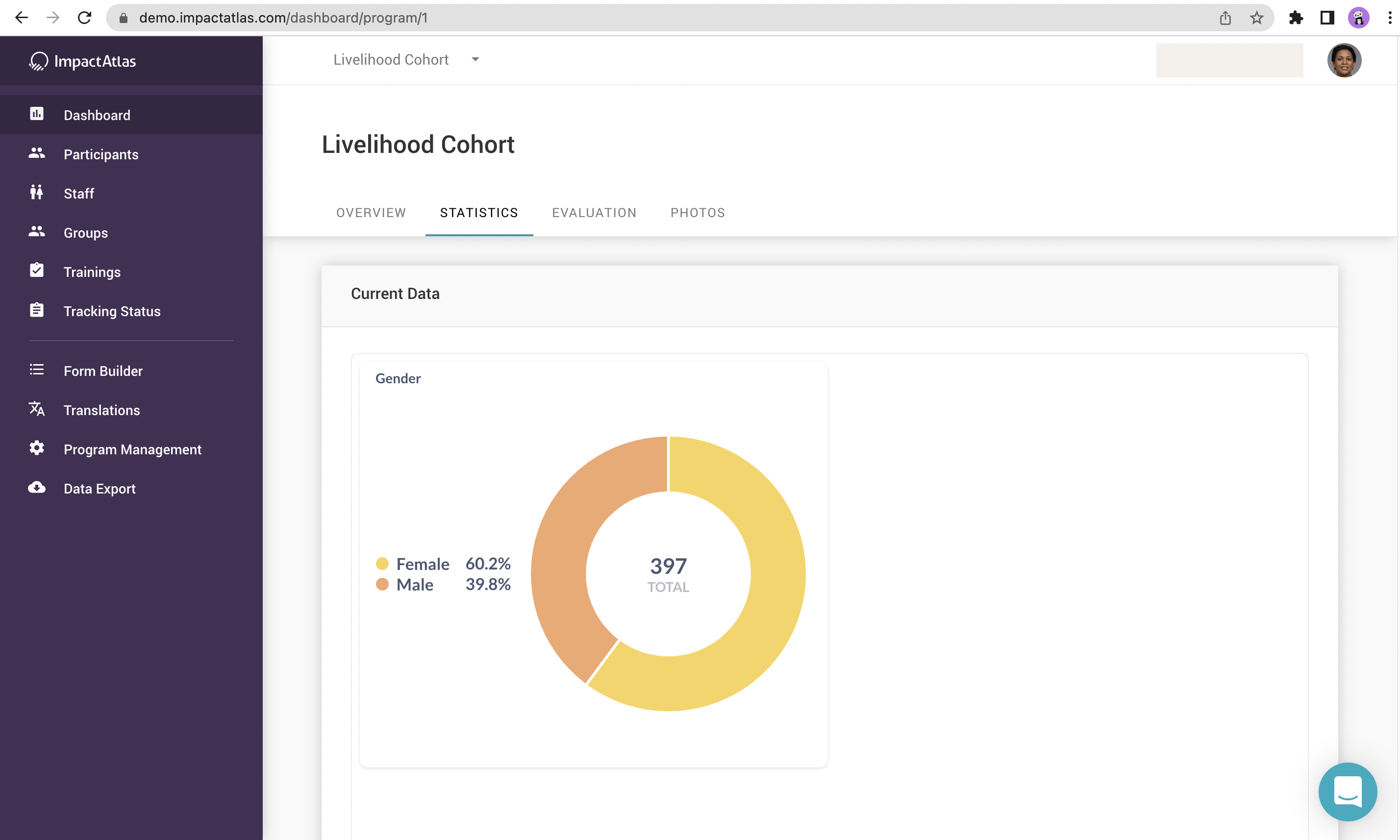
How to visualize my graphics at program / cohort level in IA?
In order to be able to visualize the graphics created at program / cohort level in IA, you select "Dashboard" in the left menu and the corresponding tab: Statistics or Evaluation based on where the graphics were created in metabase.

In our example, we created under Program Statistics Cohort 1, so we will go to Statistics tab and we should be able to visualize the chart.
.png)
How to add existing graphics to a dashboard?
To add existing graphics to a dashboard, you can go to "Our analytics", search for the desired dashboard either using the search bar in the top right or rolling down the page until you find it. Once you find it, click on it to open a new page.

Once you accessed the desired dashboard, you can click on "Edit dashboard".

Then, click on the plus sign in the top right, choose the graphic you want to add either using the search bar or rolling down the page until you find it. Once you find it, select it.

You can customize your dashboard reposition or resize the graphic, add labels, etc. Once you are done, you can save it.
